
“Color and typography are like the dynamic duo of design. They have the power to transform a simple layout into a cohesive masterpiece that captures attention and leaves an impact on viewers.
In this blog post, we will explore how these two elements work together to establish a coherent design theme that elevates your brand identity to new heights.”
What is the Theme in Design?
A design theme is a unifying idea that ties together all design elements. It can be something as simple as a color scheme or typography style. A good design theme will make your design look cohesive and professional.
There are many different ways to establish a cohesive design theme. One way is to use color to create a unified look. You can do this by choosing one or two colors you want to use throughout your design and using them consistently in different elements.
For example, if you use green and blue in your plan, you could use green for your background color and blue for your text. Another way to establish a cohesive design theme is to use typography.
You can choose one or two fonts that you want to use throughout your design and use them consistently in different elements. For example, if you use sans-serif and serif fonts in your plan, you could use sans-serif for your headings and serif for your body text.
Establishing a cohesive design theme will make your design look more professional and put together. It will also make it easier for people to navigate your website or app because they can quickly identify different elements.
Why is Establishing a Design Theme Important?
Designers often use color and typography as the starting point when creating a cohesive design theme. Establishing a consistent color palette and using similar fonts throughout your design can create a visually pleasing and unified look for your brand.
Color is one of the most essential elements of design, and it can be used to convey a certain mood or feeling. When choosing colors for your brand, consider what atmosphere you want to create.
For example, warm colors like orange and red can evoke feelings of excitement, while cool colors like blue and green can be calming and serene.
Once you’ve decided on a general color scheme, stick to it throughout your design so that everything looks cohesive.
Just like color, typography plays a crucial role in setting the tone of your design. The font you choose should match the overall aesthetic you’re going for – if your brand is playful and fun, use a more whimsical font, but if it’s sleek and modern, opt for something cleaner and simpler. Again, consistency is key – using multiple fonts will make your design look cohesive and organized.
Establishing a cohesive design theme with color and typography is essential because it helps create a unified look for your brand. When all your design elements work harmoniously, it makes a much more polished final product.
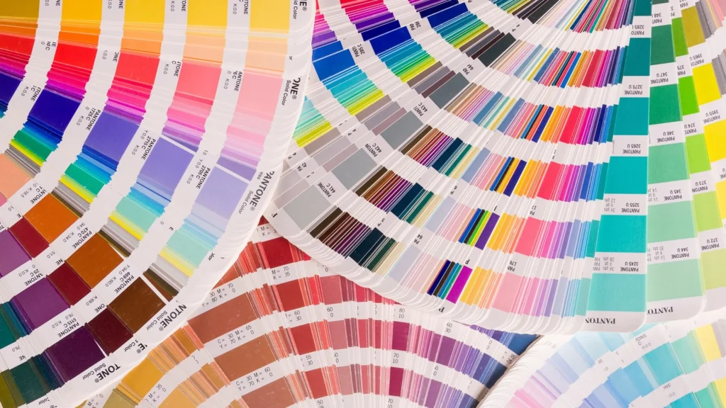
How Does Color Impact the Design Theme?
Color is one of the most critical aspects of design and can profoundly impact a piece’s overall theme. When used effectively, color can create a sense of cohesion and visual interest while also helping to communicate the desired mood or message of the design.
However, it’s important to note that not all colors are created equal. Some colors are more conducive to creating a particular atmosphere than others. For example, warm colors like red and orange are often associated with energy and excitement, while cool colors like blue and green are typically associated with calmness and relaxation.
When choosing colors for your design, it’s essential to consider how they will work together to create the desired effect. A well-coordinated color palette can make all the difference in taking a design from good to great.
What Role Does Typography Play in Developing a Cohesive Theme?
Typography is an important aspect of developing a cohesive design theme. Using similar fonts throughout the design can create a sense of unity and coherence. Typography can also be used to create contrast and visual interest. For example, using a bold font for headings can make them stand out from the rest of the text.
Color is another important element in developing a cohesive theme. A limited color palette can help create a sense of unity and coherence. Color can also be used to create contrast and visual interest. For example, using a bright color for headings can help to make them stand out from the rest of the text.
Examples of Successful Themes
An infinite number of themes can be used to create a cohesive design. However, some themes are more successful than others. Below are three examples of successful themes:
1. Minimalism: A minimalistic theme is perfect for designs that need to be clean and sleek. This type of theme uses minimal color and decoration, instead relying on simple shapes and lines to create interest.
2. Nature: A nature-themed design can bring peace and serenity to any space. This theme often uses muted colors and natural materials to create a calming atmosphere.
3. Bold and Bright: A bold and bright theme is perfect for designs that need to make a statement. This type of theme uses eye-catching colors and patterns to grab attention and create an energetic vibe.
Tips for Creating an Effective Design Theme
When it comes to cohesive design, color, and typography, play a significant role. Here are some tips for using them effectively:
1. Use a limited color palette. This will help create a sense of unity and cohesiveness in your design. Stick to 2-3 primary colors, and use accents sparingly.
2. Choose fonts that complement each other. When selecting fonts, make sure they have a similar feeling or tone. You don’t want one font to be too playful while the other is serious.
3. Use typography to create hierarchy and contrast. Utilize different font sizes and weights to make certain elements stand out. This will help guide the viewer’s eye through your design.
4. Repeat some aspects throughout your design. This could be a specific color, shape, or pattern. By repeating elements, you create visual interest and cohesion.
Conclusion
Color and typography are essential to establishing a cohesive design theme. When considered together, they can create a visual language that speaks directly to your target audience and helps them understand the message you’re trying to convey.
As designers, it is our job to ensure that we select colors and fonts that work in harmony to communicate our message effectively without any confusion or ambiguity.